
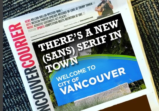
In case you missed the recent excitement that only comes when municipal politics, bureaucracy, mock outrage and typography combine, the City of Vancouver has approved a new logo, to the tune of $8,000.
Apparently the new logo is supposed to be “more identifiable to the city’s ethnically diverse population.” So instead of signs reading City of Vancouver in blue and green, with a flowery design in the corner, the new logo will read City of Vancouver in a bolder blue and green font, without a flowery design in the corner. Much clearer…
Not surprisingly, the city’s opposition councillors fulfilled their job descriptions by opposing the new logo, with NPA Coun. Melissa de Genova taking to Twitter to express her indignation.
Why didn't we incorporate our strong aboriginal history, mountains, water or other unique #Vancouver symbols in new logo? #vanpoli pic.twitter.com/GEciuL0kiH
— Melissa De Genova (@MelissaDeGenova) February 22, 2017
Note to selves: Do not hire Melissa de Genova as our graphic designer or interior decorator.
Regardless of what you think of the new logo (we’re guessing your opinion will depend on whether you’ve ever used the term “Moonbeam” to describe the mayor), we’re most excited about the newspaper headline possibilities. For instance:
- Font and centre
- All’s not quiet on the western font
- Hard bore logo
- Type oh negative
And our personal favourite courtesy of a loyal reader:
You guys can use this. @VanCourierNews @MidlifeMan1 #vancouverlogo pic.twitter.com/CQsbT172VI
— Brock Ellis (@Brock_Ellis) February 23, 2017
@KudosKvetches


